Sent to you by David Andrew via Google Reader:
 Like Infographics (I do), then you might like to try out Visual.ly, a tool that enables you to create your own (basic) infographic quickly and easily.
As reported on Mashable this week:
"The tool will eventually use APIs from sources including ESPN, the Economist and social media sites to compile and create data visualizations. At its launch, the startup is offering templates that use the Facebook or Twitter API."
How great is this – use a one-stop tool to generate an information resources for use in learning materials? OK, it is a little basic at the moment, and you'll need to be clever about how you input the details of information, hashtag, etc but you can get some good results, using the standard templates provided.
I see this as something that could grow into a valuable classroom resource, whether it is something we use to create and generate for the students to use or discuss, or something the students can use to generate work for a classroom activity, discussion, etc. how do you use infographics, and do you see this as something that you would use (if so, how?)
Here are a couple I created earlier (click to enlarge):

Visual.ly infographic for @hopkinsdavid
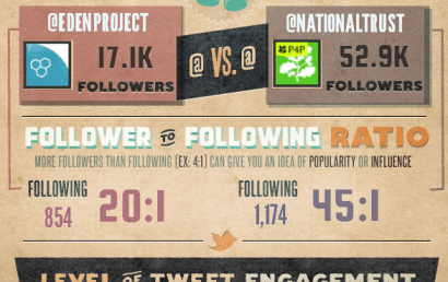
Visual.ly infographic comparing the Twitter accounts of The Eden Project and National Trust
However, be warned. I have not found it easy to create these, nor was it straight forward at all. On many occasions the infographic simply did not work, I was not able to download or embed it, I kept having new windows popping up all over the place, I was logged out countless times, and it is only through sheer determination that I continued and got these two above done – I would normally have given up long before now! I am sure the service will improve … ?
Related posts:
Things you can do from here:
- Subscribe to eLearning Blog Dont Waste Your Time using Google Reader
- Get started using Google Reader to easily keep up with all your favorite sites


